YEAR
2021
TYPE
STUDENT PROJECT
PRINT EPHEMERA
ILLUSTRATION
Parks
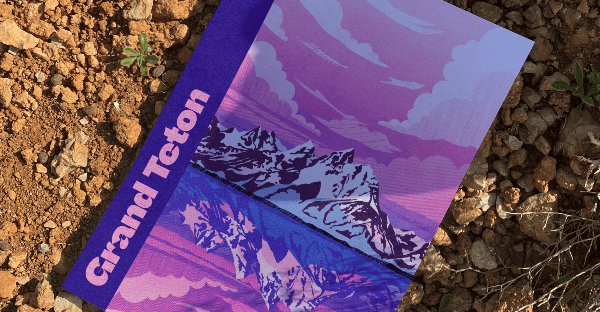
Parks is the capstone project I completed for my undergraduate degree. I've always been very enamored with the natural beauty of the American West & inspired by much of the design created for the national parks over the past 200 years. I set out to create my own ode to the parks by crafting a fictional design/illustration system — one that could be applied to many individual pieces of ephemera that visitors could collect and cherish for years to come.
RESEARCH & INSPIRATION
RESEARCH & INSPIRATION
RESEARCH & INSPIRATION
RESEARCH & INSPIRATION
The first order of business was establishing my design & illustration styles. I looked to some of my favorite landscape illustrators (Charlie Davis and Petra Eriksson, shown below) and borrowed from their excellent uses of color, texture, framing, and depth.
Vignelli's famous work for the National Park Service is still successful to this day because it is beautiful and highly scalable. I sought to bring in some of those same Swiss influences (with a contemporary twist) while considering how to make my own designs just as scalable.
I looked to some of my favorite landscape illustrators (Charlie Davis and Petra Eriksson, shown below) and borrowed from their excellent uses of color, texture, framing, and depth.
Vignelli's famous work for the National Park Service is still successful today because it is beautiful, modular, and highly scalable. I sought to bring in some of those Swiss influences (with a contemporary twist) while considering how to make my designs just as scalable.
The first order of business was establishing my design & illustration styles. I looked to some of my favorite landscape illustrators (Charlie Davis and Petra Eriksson, shown below) and borrowed from their excellent uses of color, texture, framing, and depth.
Vignelli's famous work for the National Park Service is still successful today because it is beautiful, modular, and highly scalable. I sought to bring in some of those Swiss influences (with a contemporary twist) while considering how to make my designs just as scalable.
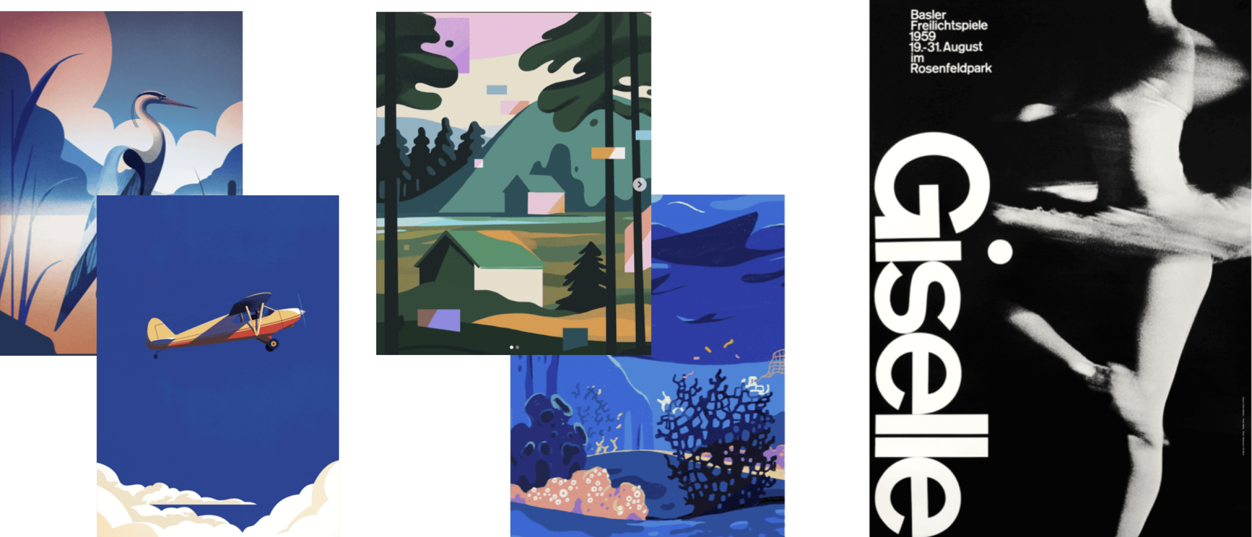
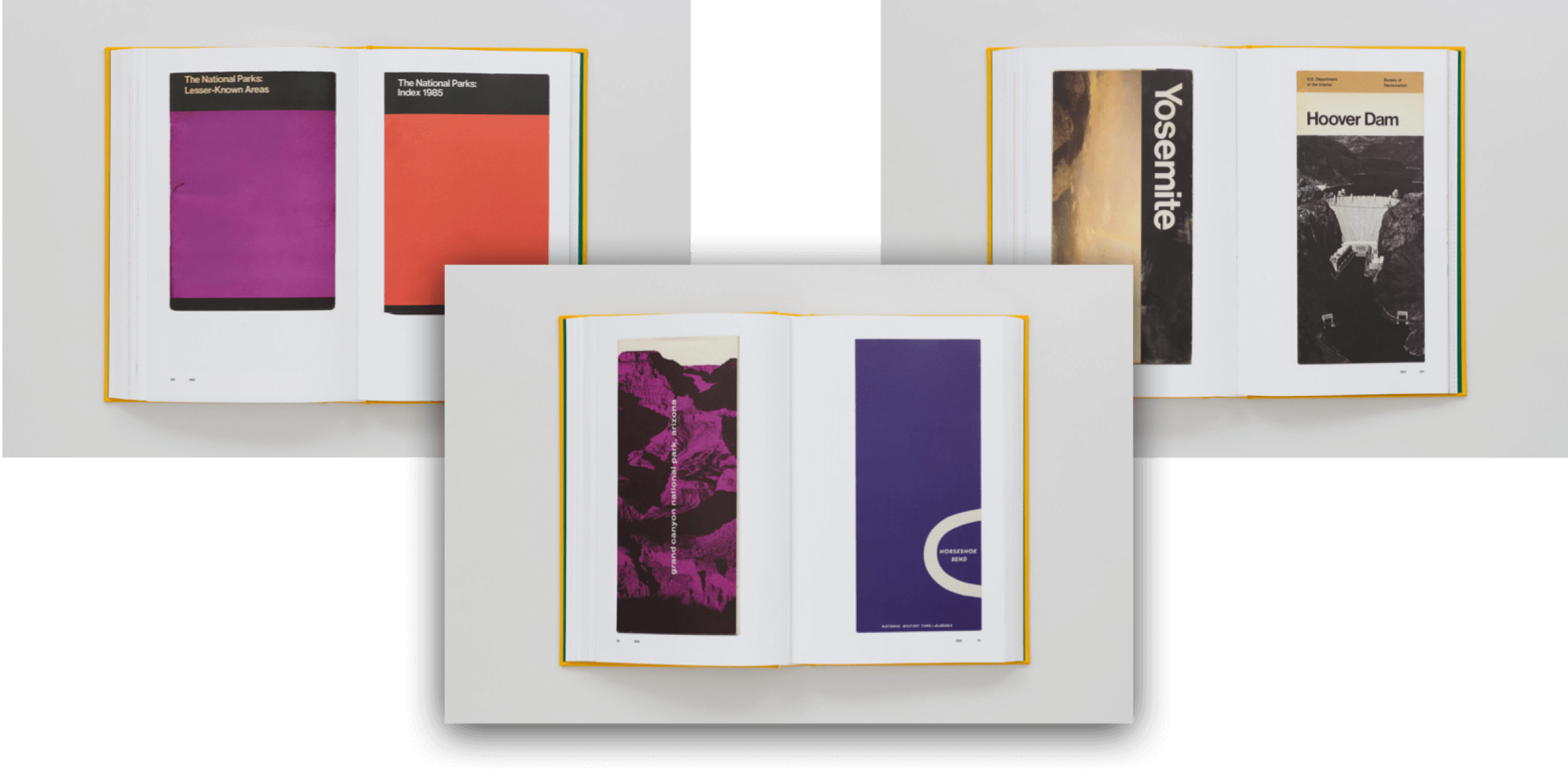
ILLUSTRATION PROCESS
ILLUSTRATION PROCESS
ILLUSTRATION PROCESS
ILLUSTRATION PROCESS
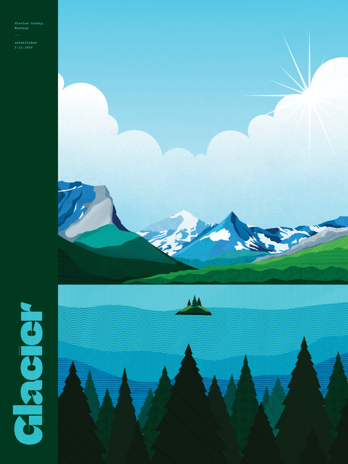
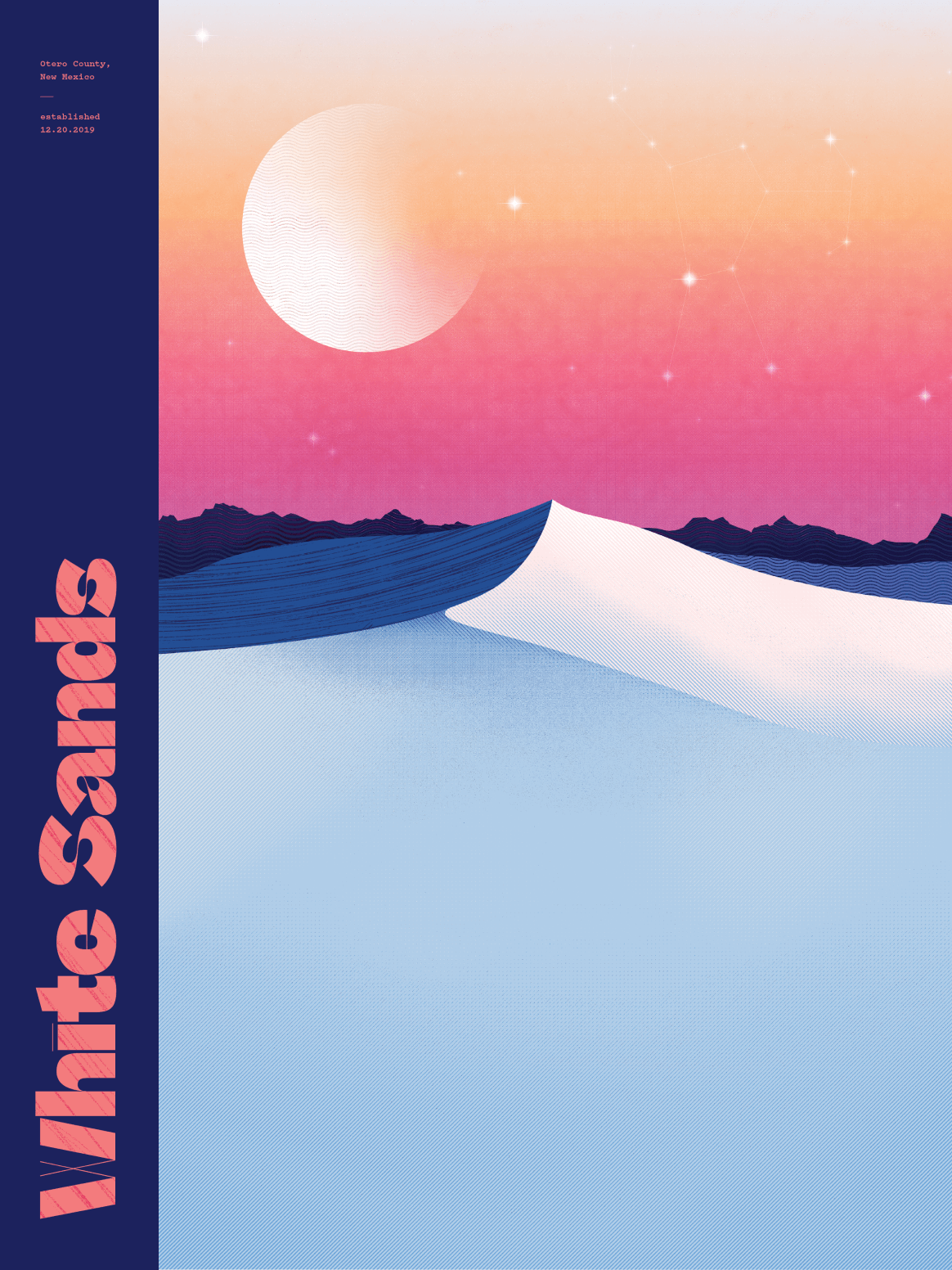
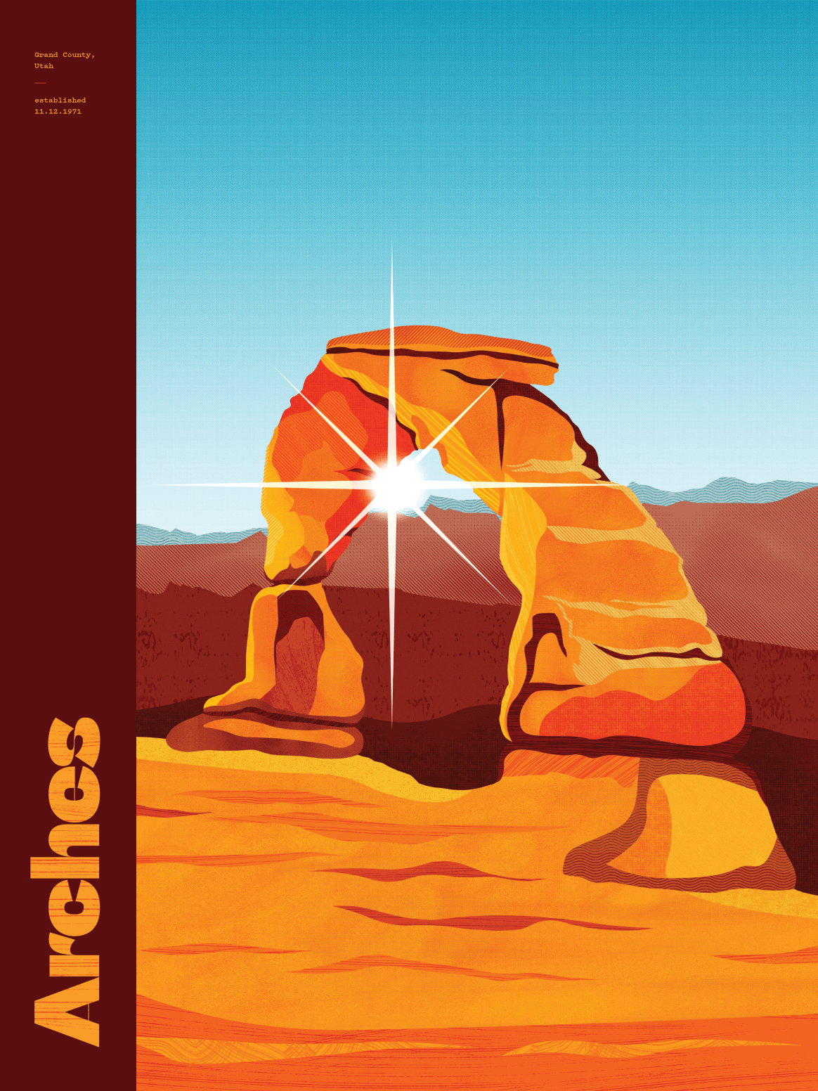
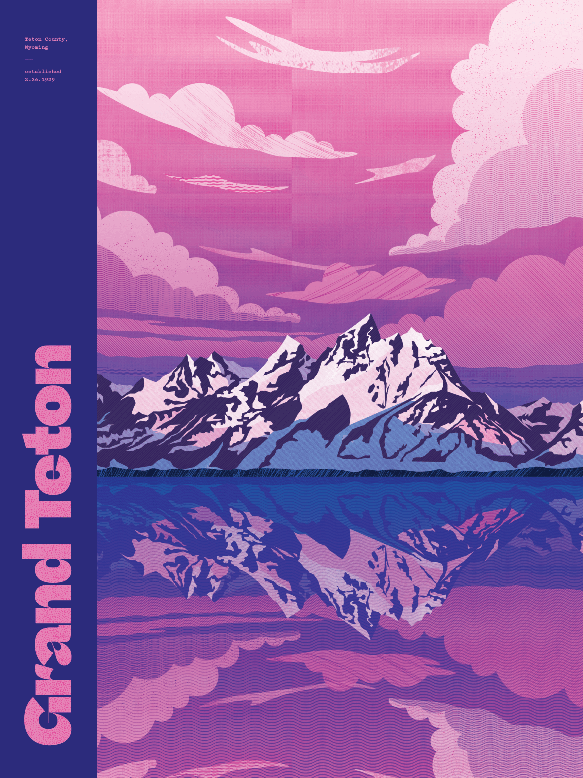
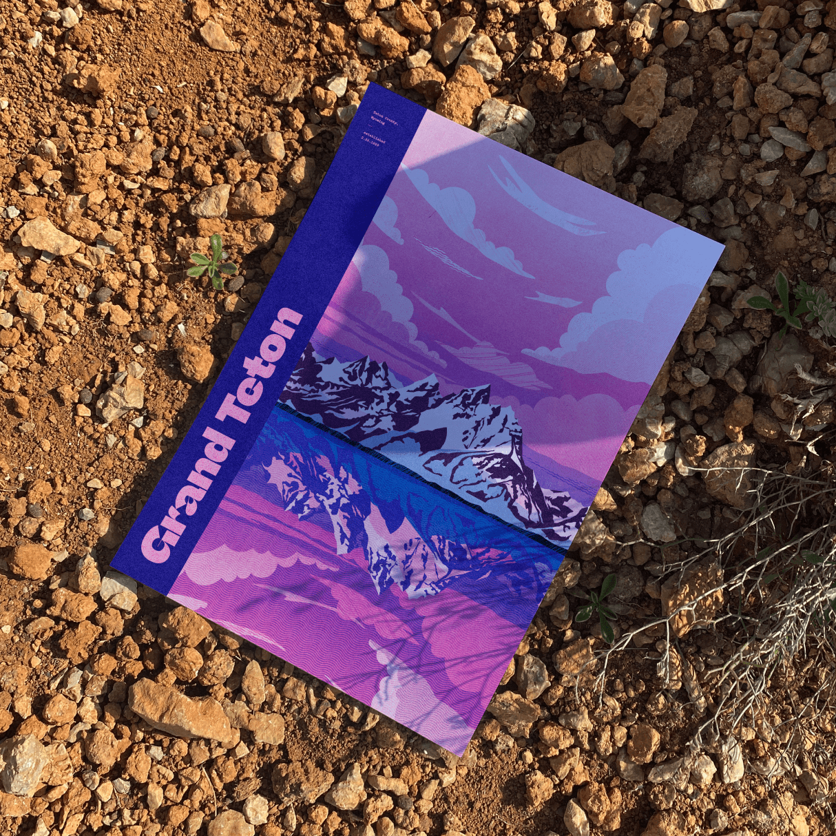
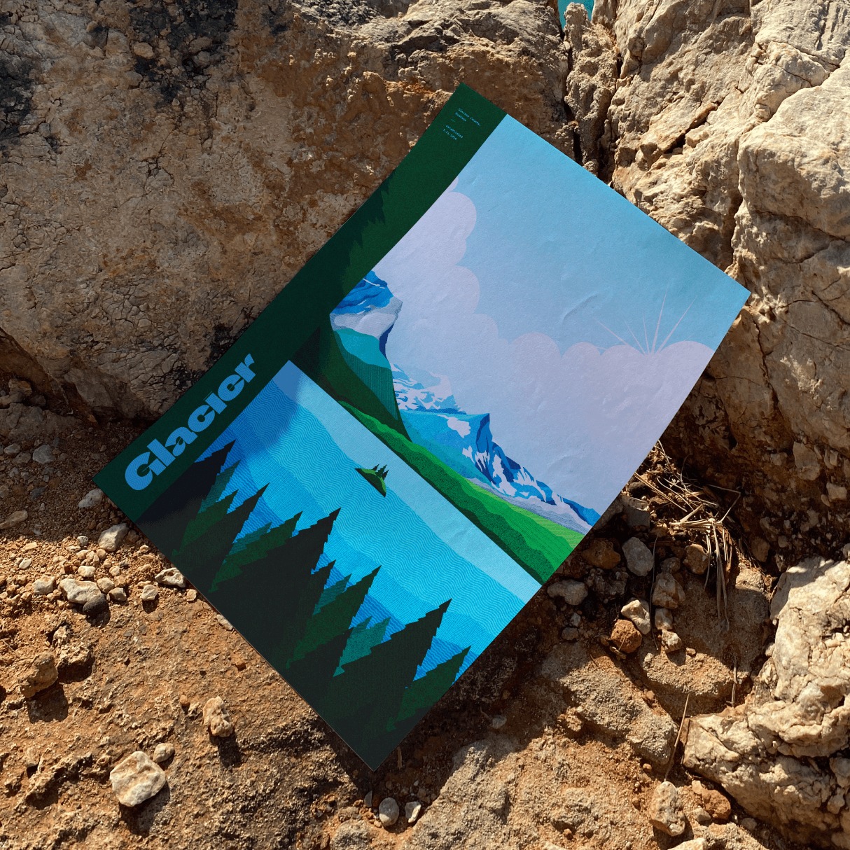
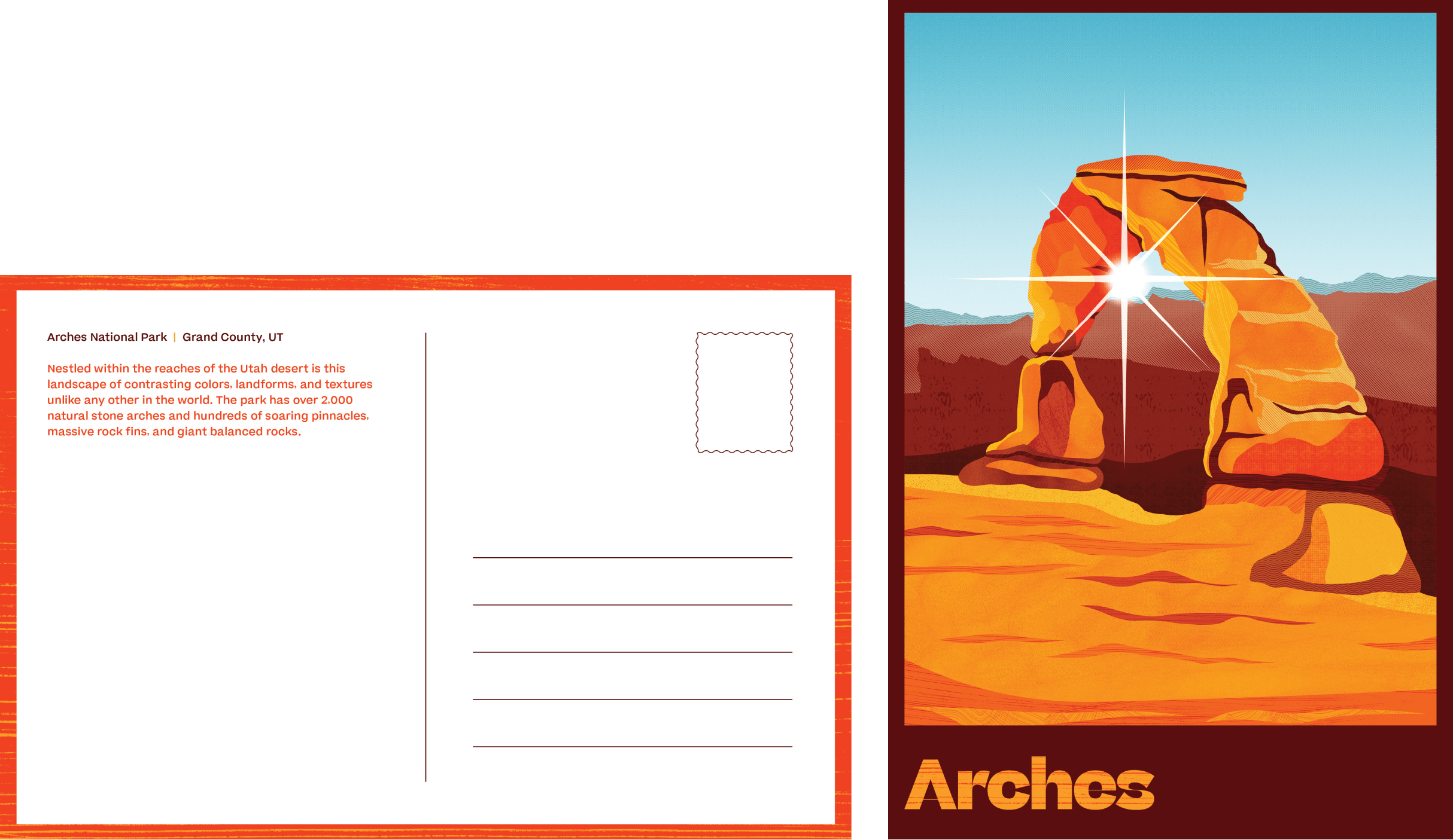
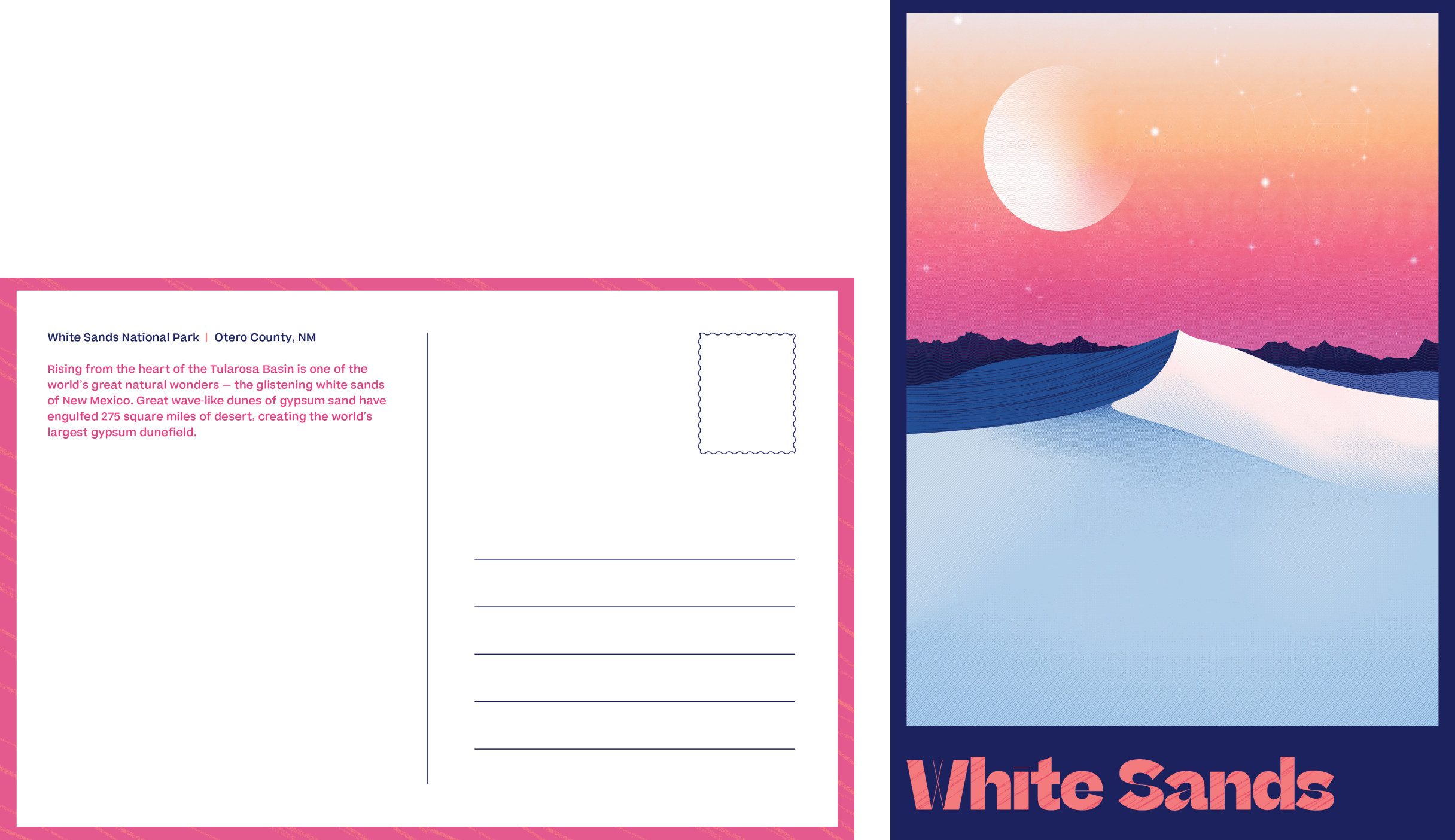
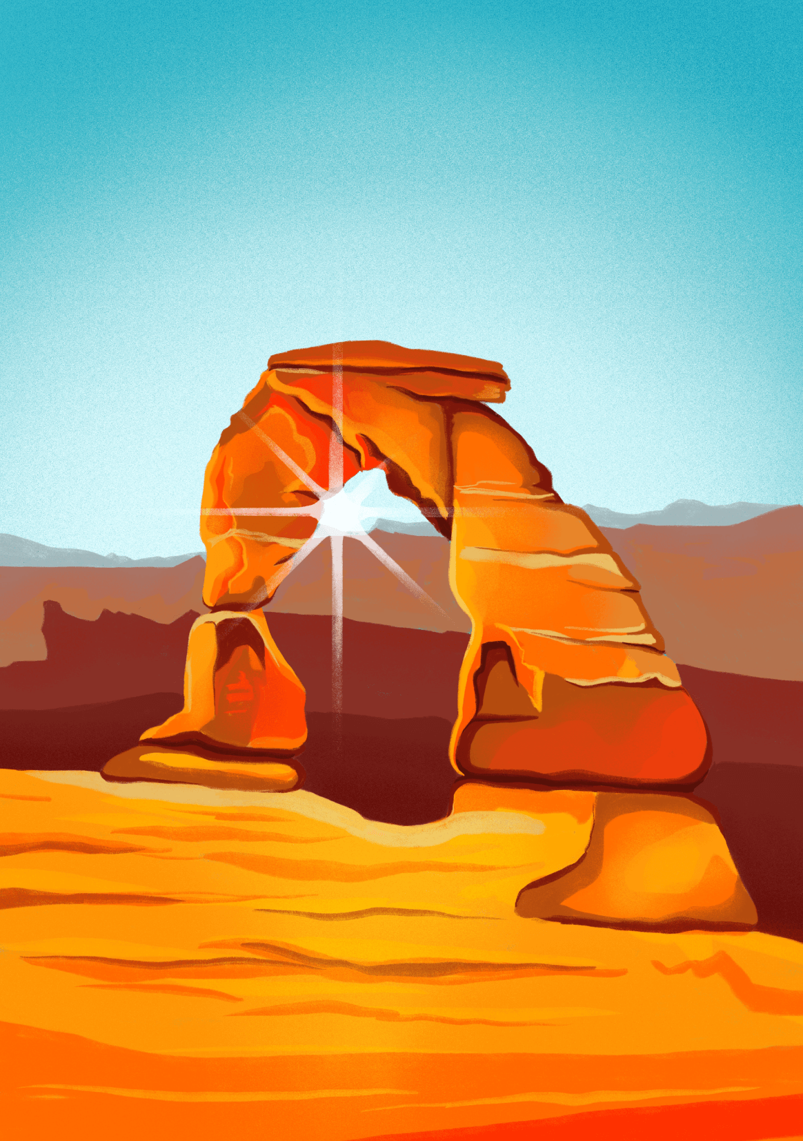
I chose four parks dotted around different areas of the United States, aiming for a breadth of color and texture in my landscapes. I began with sketches and then brought the designs into Photoshop to clean up my shapes and add detail & texture.
I chose four parks dotted around different areas of the United States, aiming for a breadth of color and texture in my landscapes. I began with sketches and then brought the designs into Photoshop to clean up my shapes and add detail & texture.
I chose four parks dotted around different areas of the United States, aiming for a breadth of color and texture in my landscapes. I began with sketches and then brought the designs into Photoshop to clean up my shapes and add detail & texture.
I chose four parks dotted around different areas of the United States, aiming for a breadth of color and texture in my landscapes. I began with sketches and then brought the designs into Photoshop to clean up my shapes and add detail & texture.
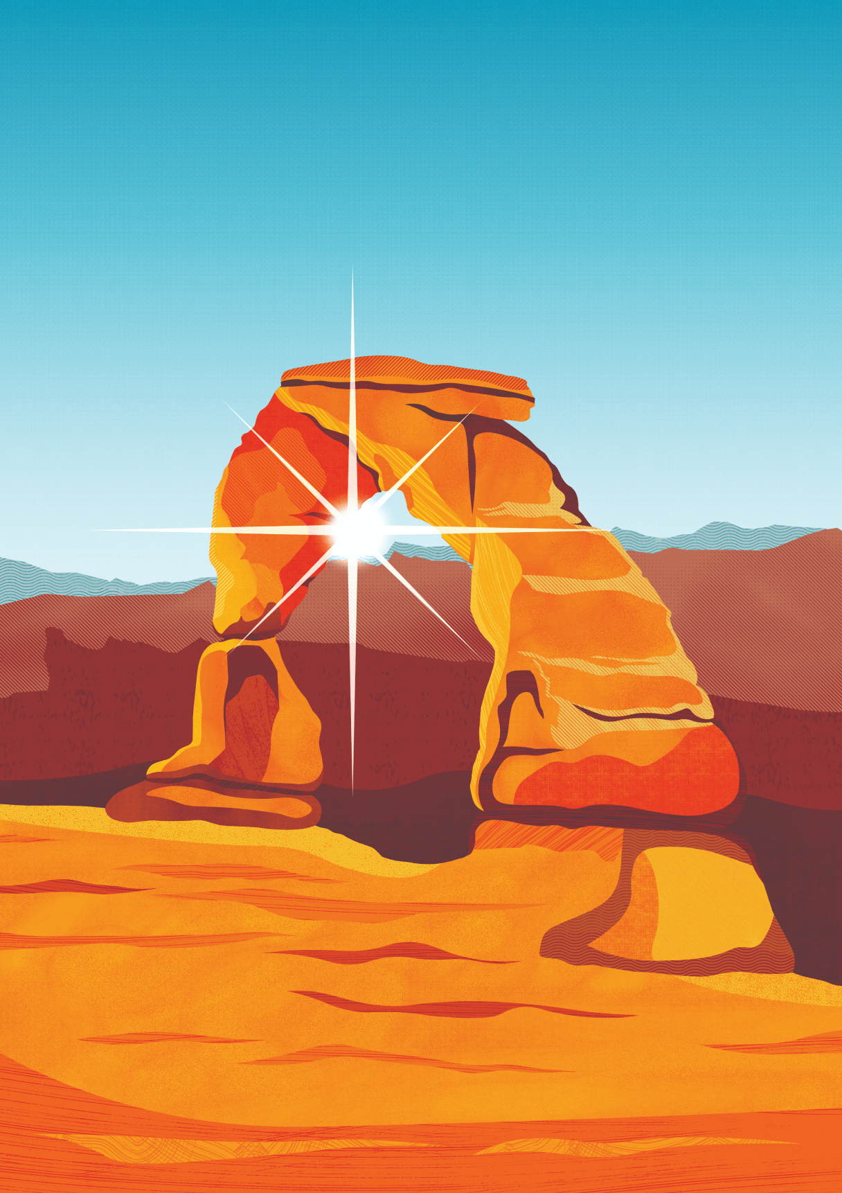
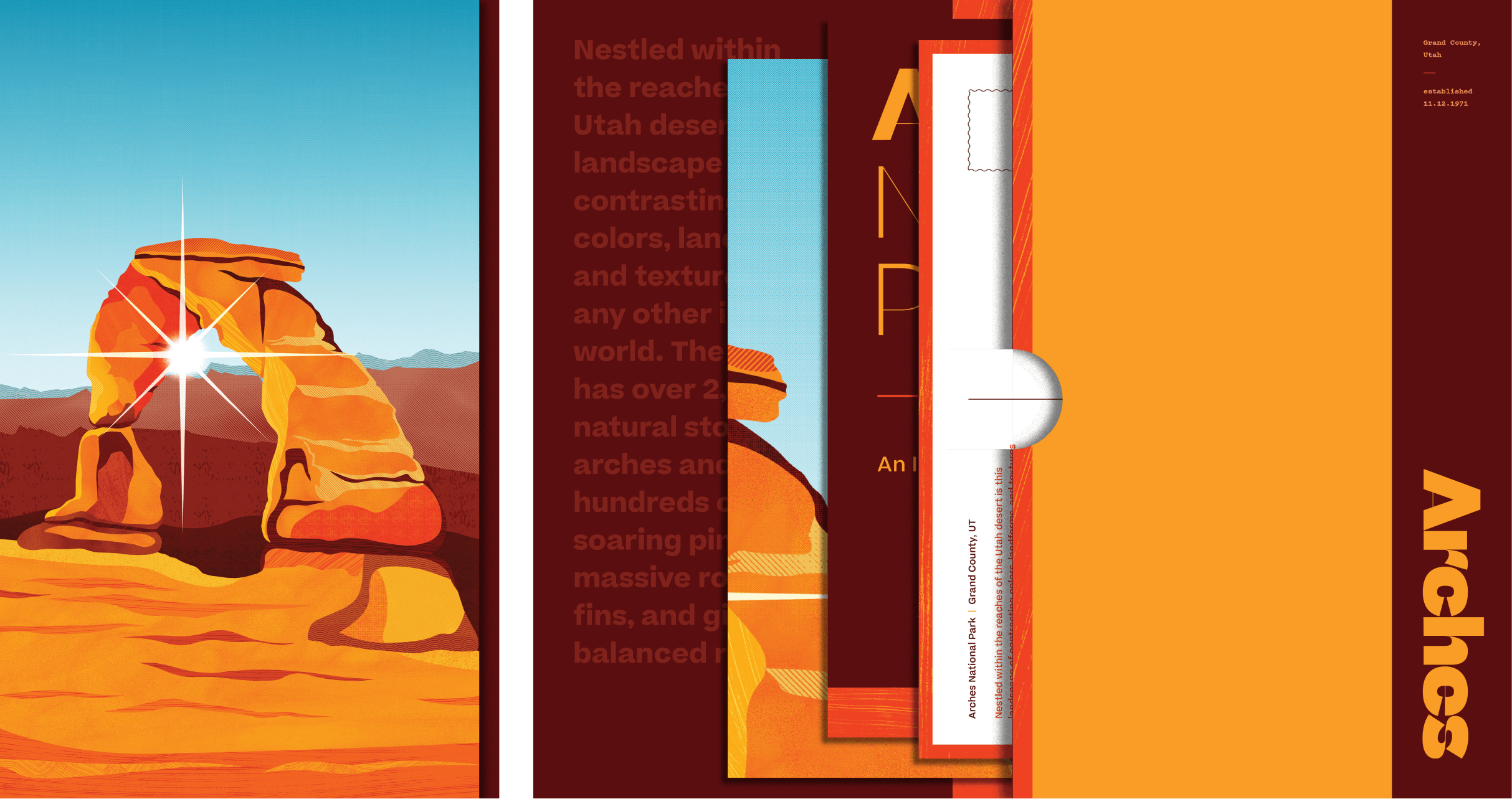
Arches Natl. Park
Arches Natl. Park
Arches Natl. Park
Arches Natl. Park
Arches Natl. Park
Utah
Utah
Utah
Utah
Utah
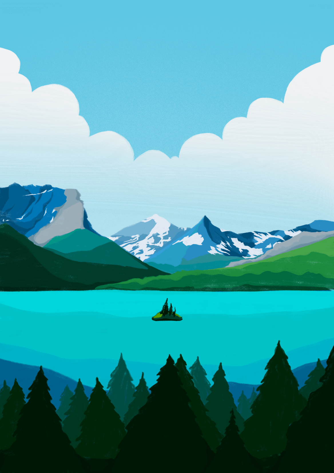
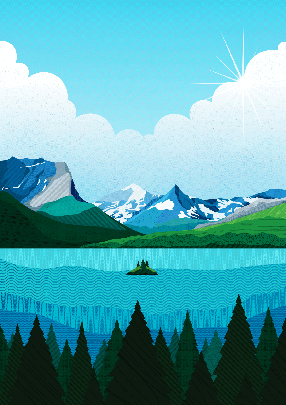
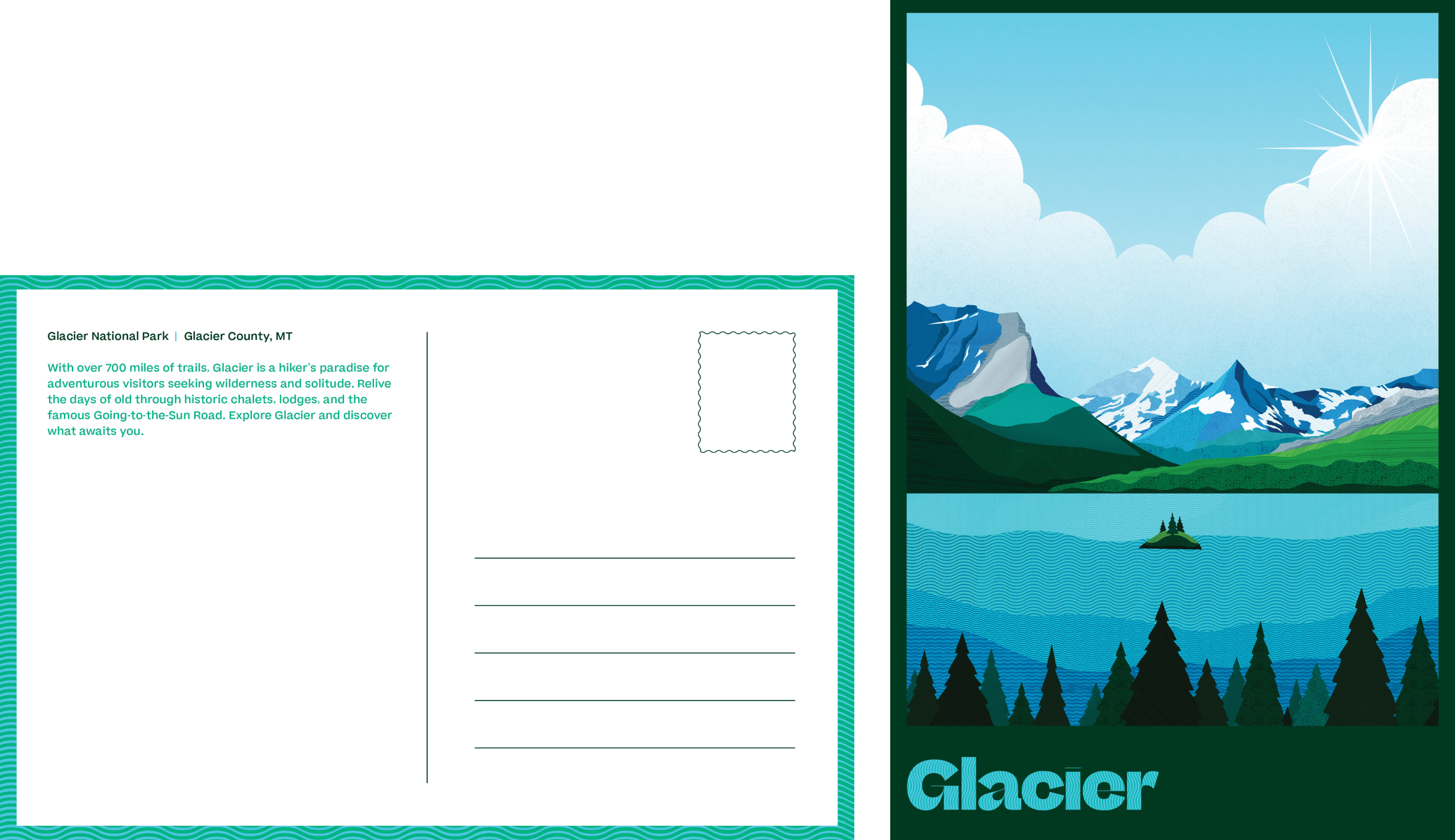
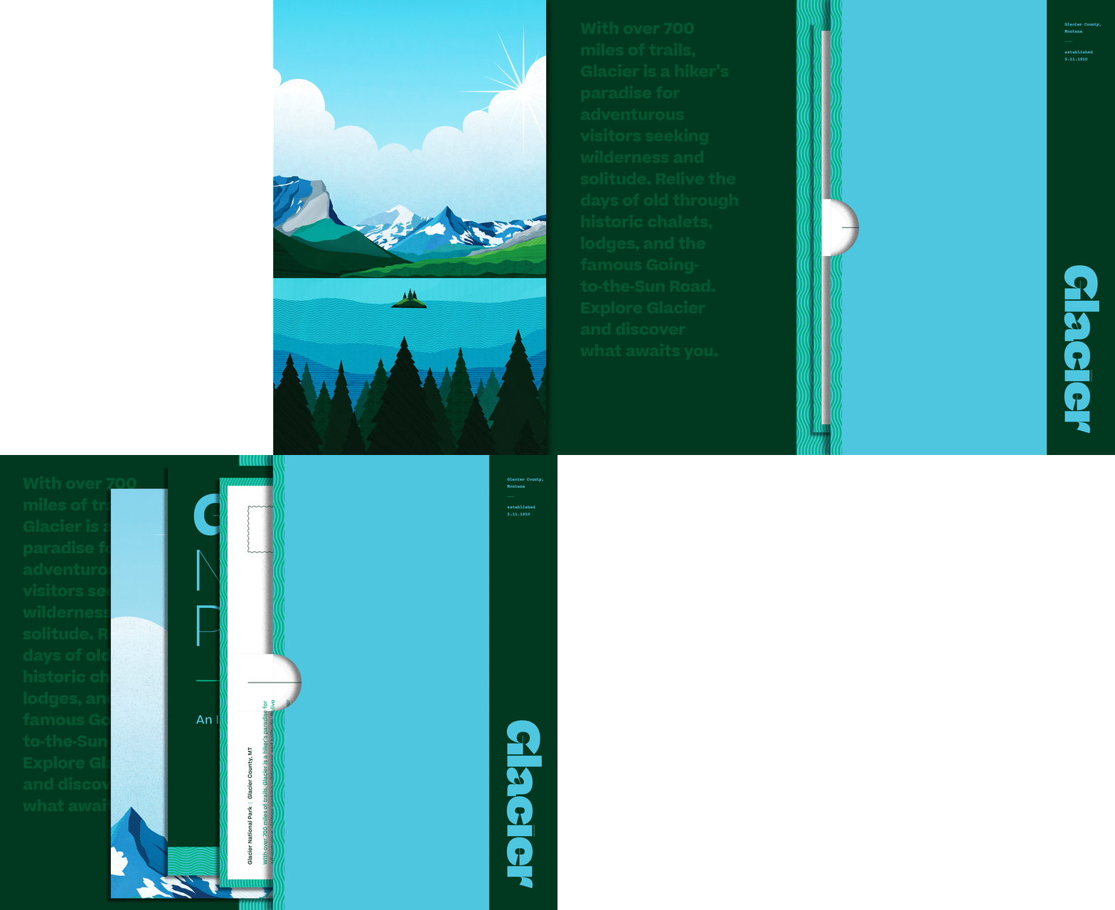
Glacier Natl. Park
Glacier Natl. Park
Glacier Natl. Park
Glacier Natl. Park
Montana
Montana
Montana
Montana
Montana
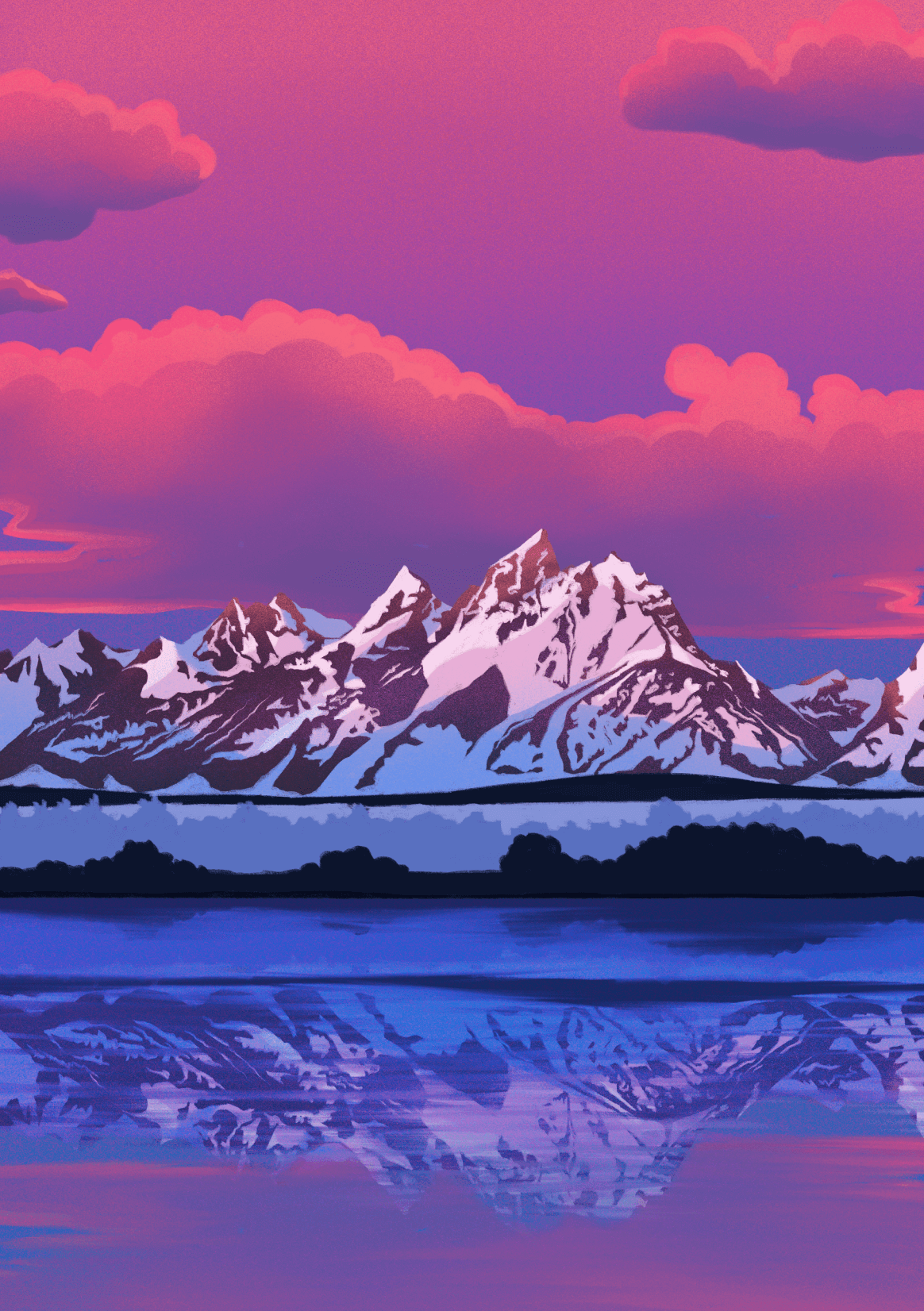
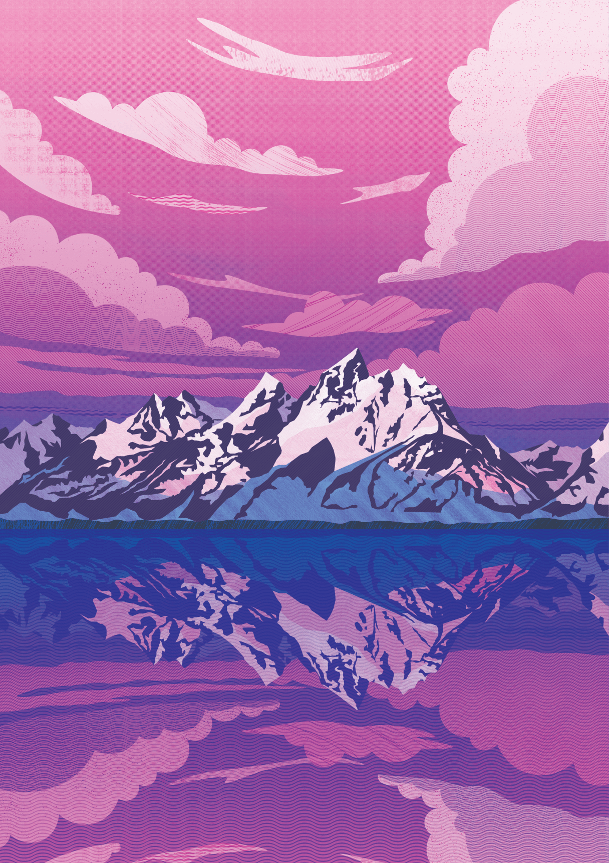
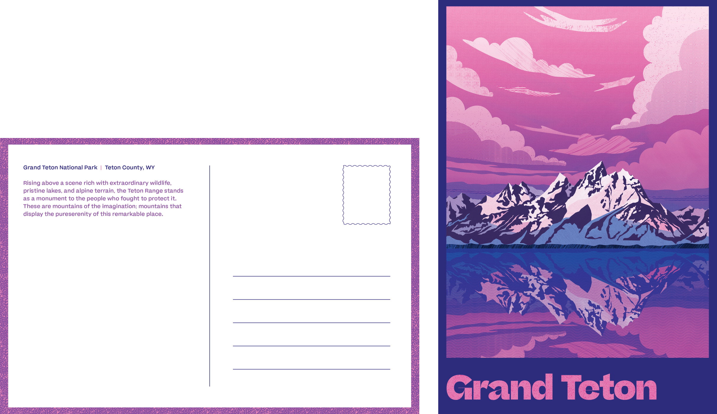
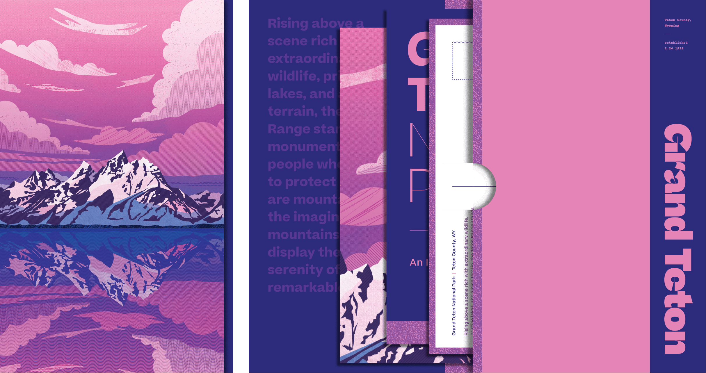
Grand Teton Natl. Park
Grand Teton Natl. Park
Grand Teton Natl. Park
Grand Teton Natl. Park
Wyoming
Wyoming
Wyoming
Wyoming
Wyoming
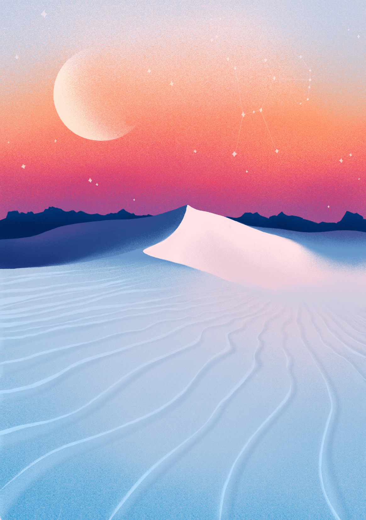

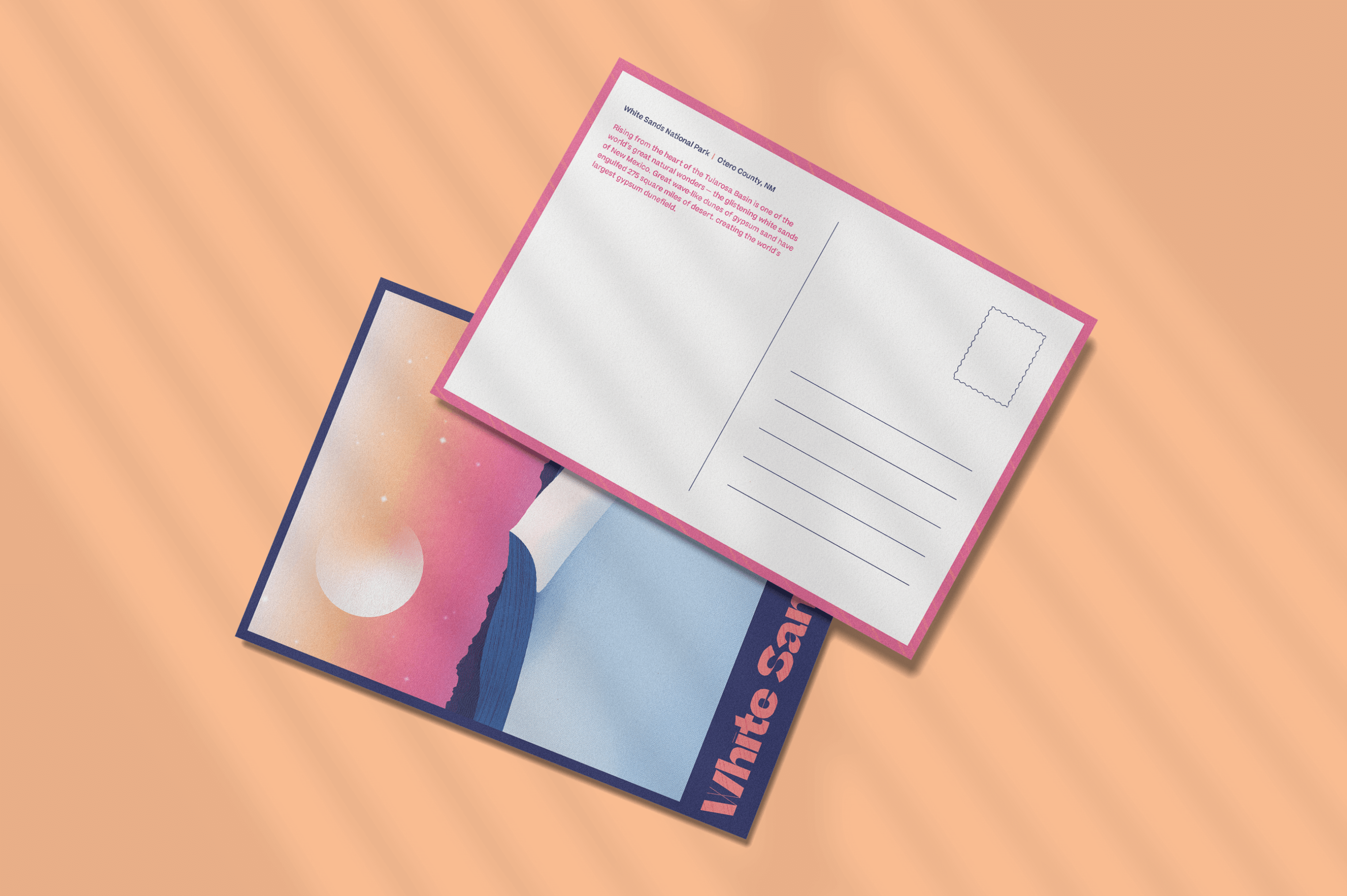
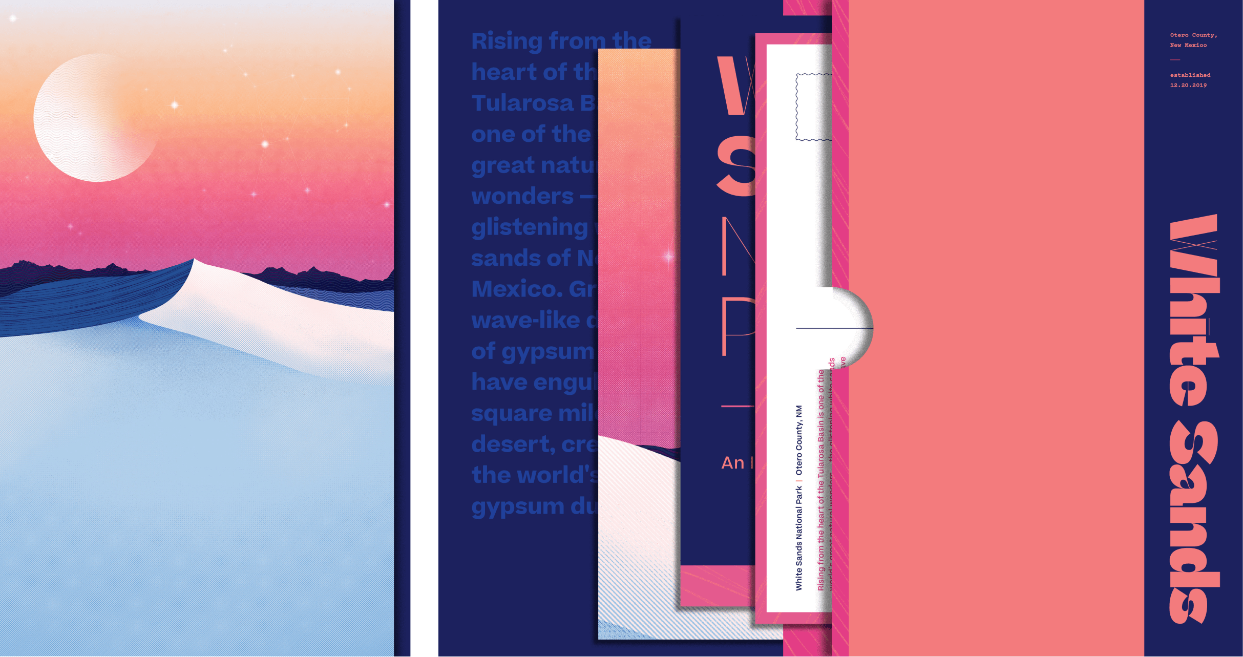
White Sands Natl. Park
White Sands Natl. Park
White Sands Natl. Park
White Sands Natl. Park
New Mexico
New Mexico
New Mexico
New Mexico
New Mexico
EPHEMERA CREATION
EPHEMERA CREATION
EPHEMERA CREATION
EPHEMERA CREATION
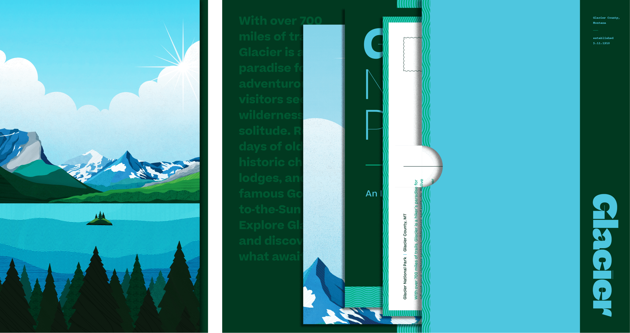
I created three pieces of printed ephemera for each of the four parks: posters, postcards, and an informational booklet. For each park's collection of three items, I created a "package" to hold & preserve everything in one place for easy distribution at each location. The goal was to make the experience of interacting with the printed package as beautiful as each individual piece.
I created three pieces of printed ephemera for each of the four parks: posters, postcards, and an informational booklet. For each park's collection of three items, I created a "package" to hold & preserve everything in one place for easy distribution at each location. The goal was to make the experience of interacting with the printed package as beautiful as each individual piece.
I created three pieces of printed ephemera for each of the four parks: posters, postcards, and an informational booklet. For each park's collection of three items, I created a "package" to hold & preserve everything in one place for easy distribution at each location. The goal was to make the experience of interacting with the printed package as beautiful as each individual piece.
I created three pieces of printed ephemera for each of the four parks: posters, postcards, and an informational booklet. For each park's collection of three items, I created a "package" to hold & preserve everything in one place for easy distribution at each location. The goal was to make the experience of interacting with the printed package as beautiful as each individual piece.
