YEAR
2022
Company
DRIFt
role
BRAND STRATEGY
CREATIVE DIRECTION
VISUAL DESIGN
WEB DESIGN
COLLABORATORS
MICHELLE BALABAN, JESS MCCORMICK
Drift Rebrand
Drift is a B2B startup specializing in conversational marketing & sales. As the company grew and moved up-market, it became paramount that its visual identity and brand positioning evolve in tandem. Between 2021 and 2022, I and a team of two other designers conceptualized & executed a full-scale, in-house rebrand at Drift — the scope of which included an updated visual language, bespoke photography, and a complete website redesign. The result was a reinvented brand system that pulled from Drift’s scrappy, creative roots all while successfully positioning the company to do business in a more competitive market.
HISTORY & CONTEXT
HISTORY & CONTEXT
HISTORY & CONTEXT
HISTORY & CONTEXT
This was not the first evolution of the Drift brand. At its inception, Drift was grungy and tactile, with graffiti influences and lots of texture and angles. In 2020, Drift worked with an external agency with the goal of refining its visual identity, maturing as a brand, and appealing to a more upmarket and enterprise audience. But in the process, its unique voice was lost. Drift started to blend in.
This was not the first evolution of the Drift brand. At its inception, Drift was grungy and tactile, with graffiti influences and lots of texture and angles. In 2020, Drift worked with an external agency with the goal of refining its visual identity, maturing as a brand, and appealing to a more upmarket and enterprise audience. But in the process, its unique voice was lost. Drift started to blend in.
This was not the first evolution of the Drift brand. At its inception, Drift was grungy and tactile, with graffiti influences and lots of texture and angles. In 2020, Drift worked with an external agency with the goal of refining its visual identity, maturing as a brand, and appealing to a more upmarket and enterprise audience. But in the process, its unique voice was lost. Drift started to blend in.
This was not the first evolution of the Drift brand. At its inception, Drift was grungy and tactile, with graffiti influences and lots of texture and angles. In 2020, Drift worked with an external agency with the goal of refining its visual identity, maturing as a brand, and appealing to a more upmarket and enterprise audience. But in the process, its unique voice was lost. Drift started to blend in.
This was not the first evolution of the Drift brand. At its inception, Drift was grungy and tactile, with graffiti influences and lots of texture and angles. In 2020, Drift worked with an external agency with the goal of refining its visual identity, maturing as a brand, and appealing to a more upmarket and enterprise audience. But in the process, its unique voice was lost. Drift started to blend in.
Drift 1.0
2015 – 2020
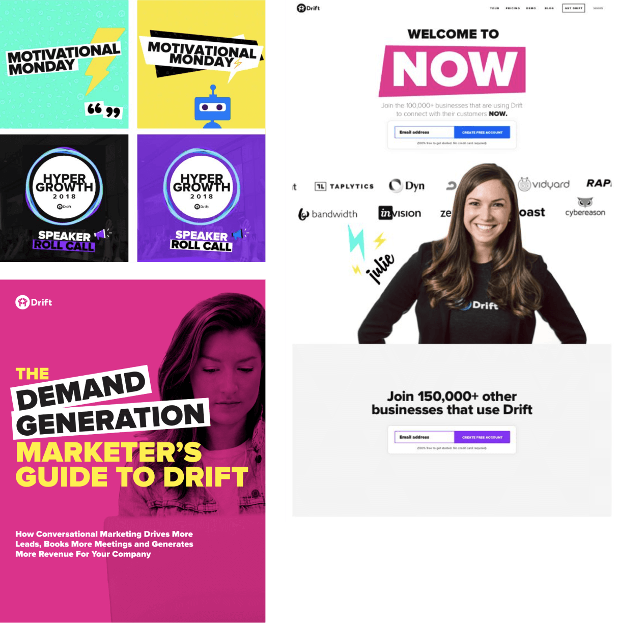
Drift 1.5
2020 – 2022
THE GOAL
Evolve, but reconnect with the Drift roots. Create a flexible, scalable, and evergreen visual identity. Quit the corporate SaaS blues. Stand out from the pack. Have a little bit more fun.
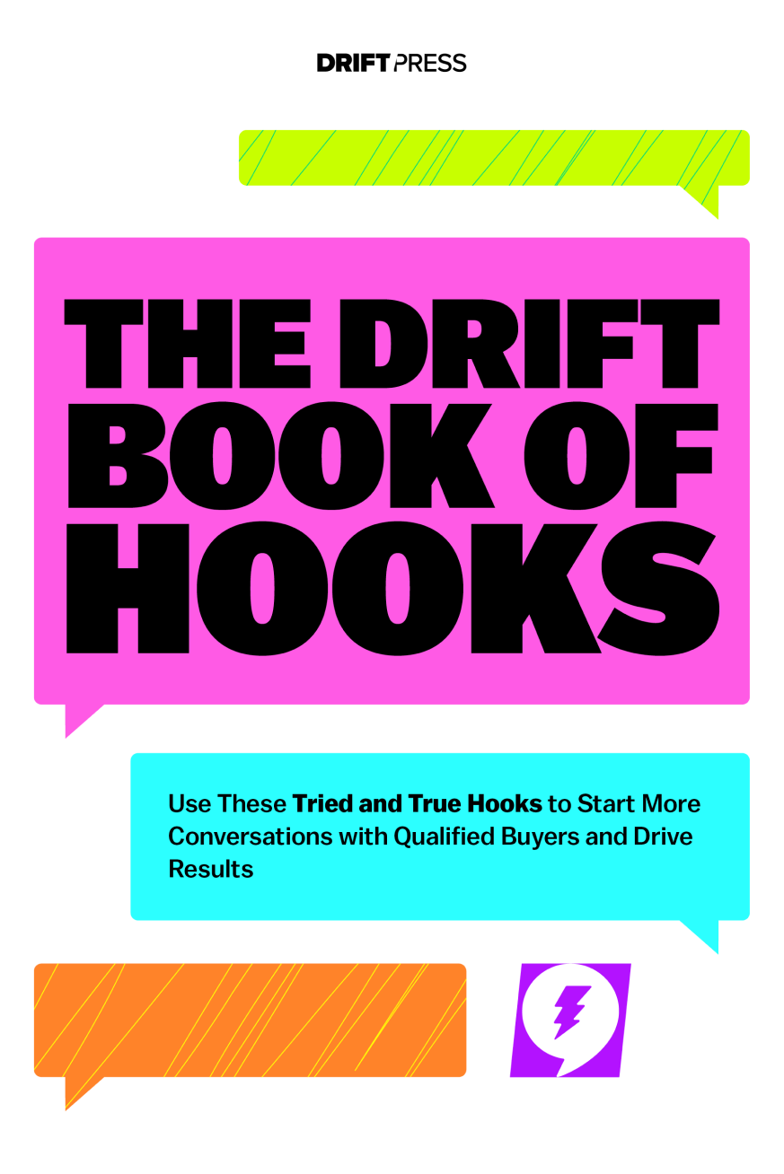
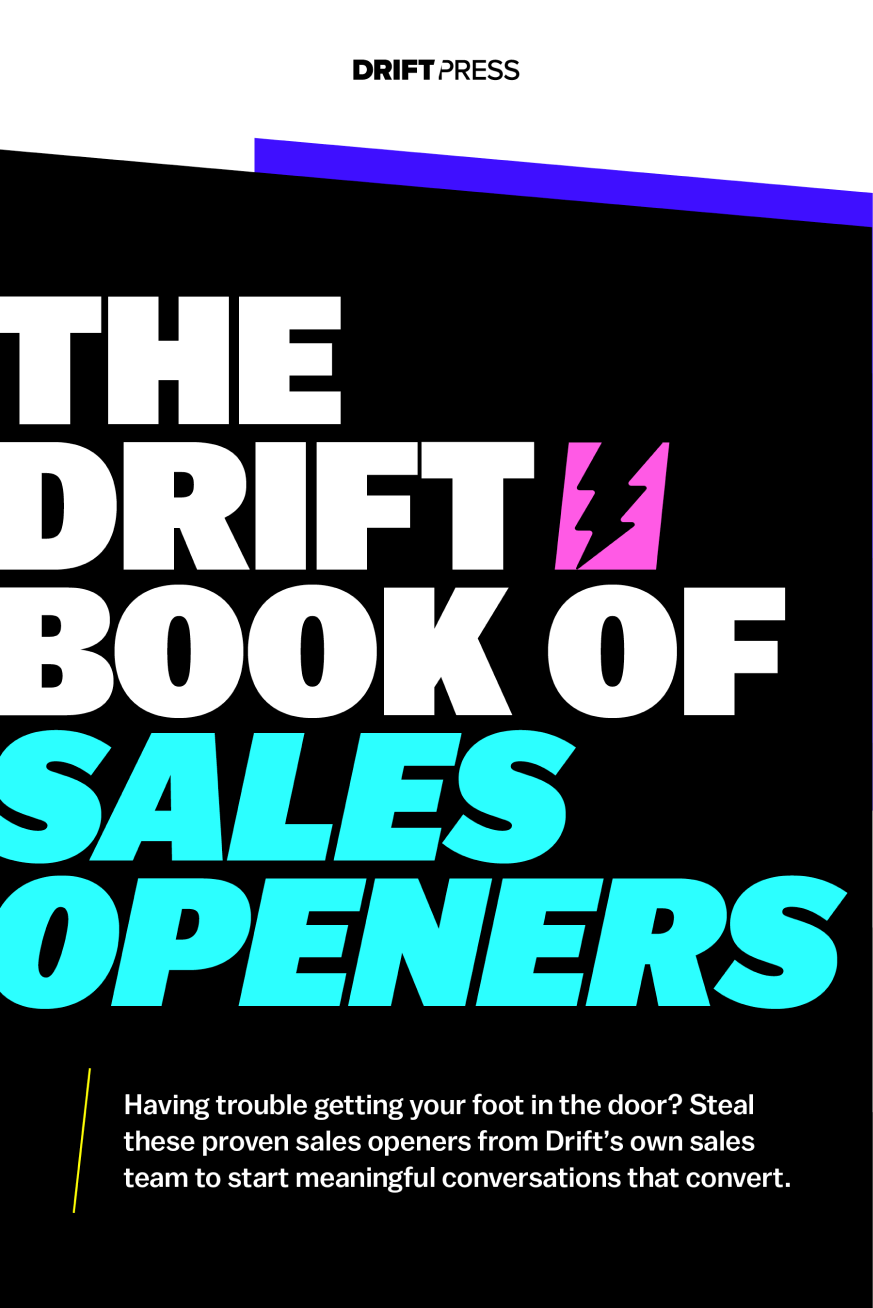
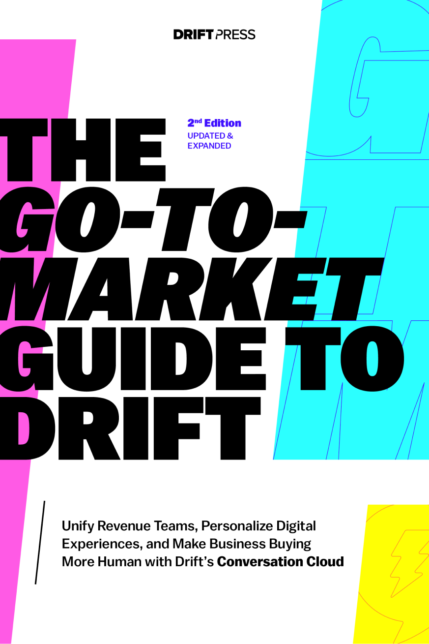
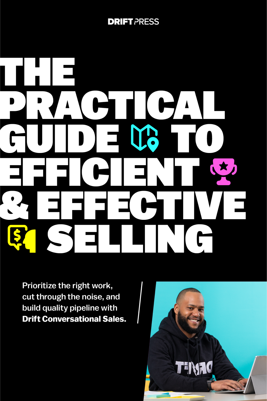
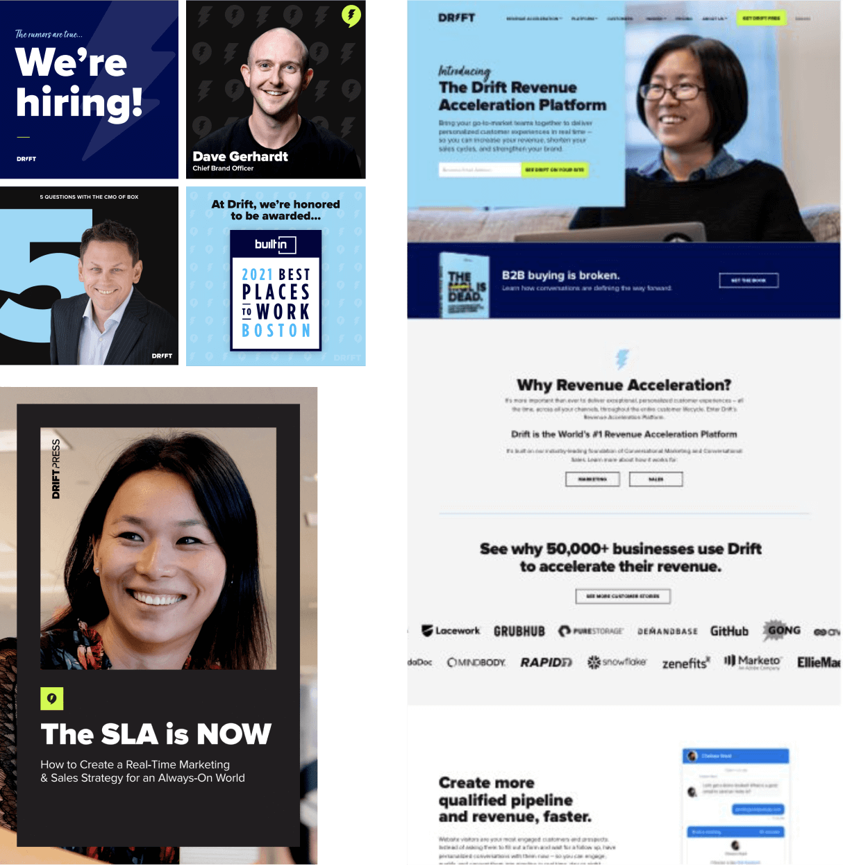
DRIFT 2.0
DRIFT 2.0
DRIFT 2.0
DRIFT 2.0
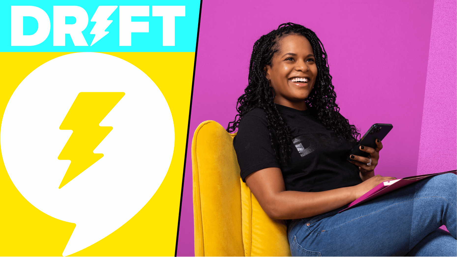
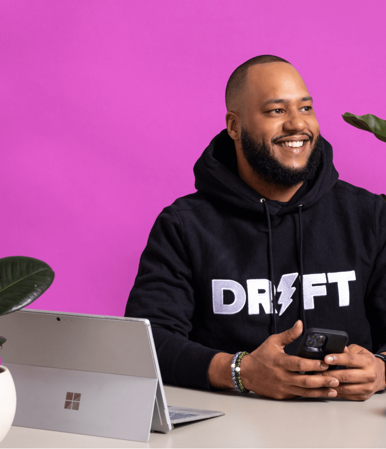
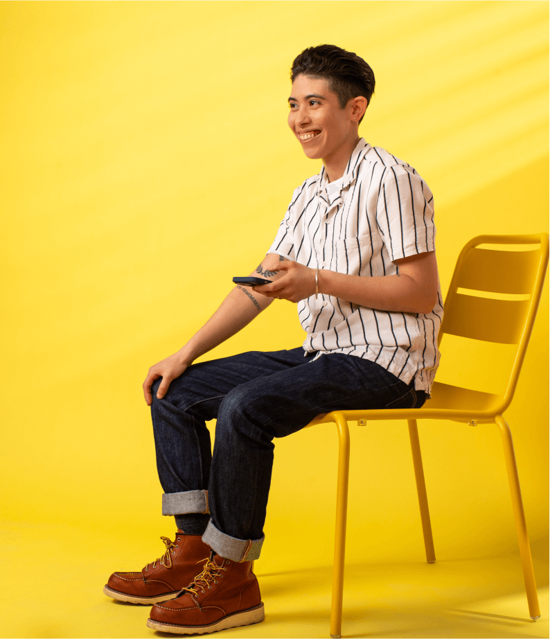
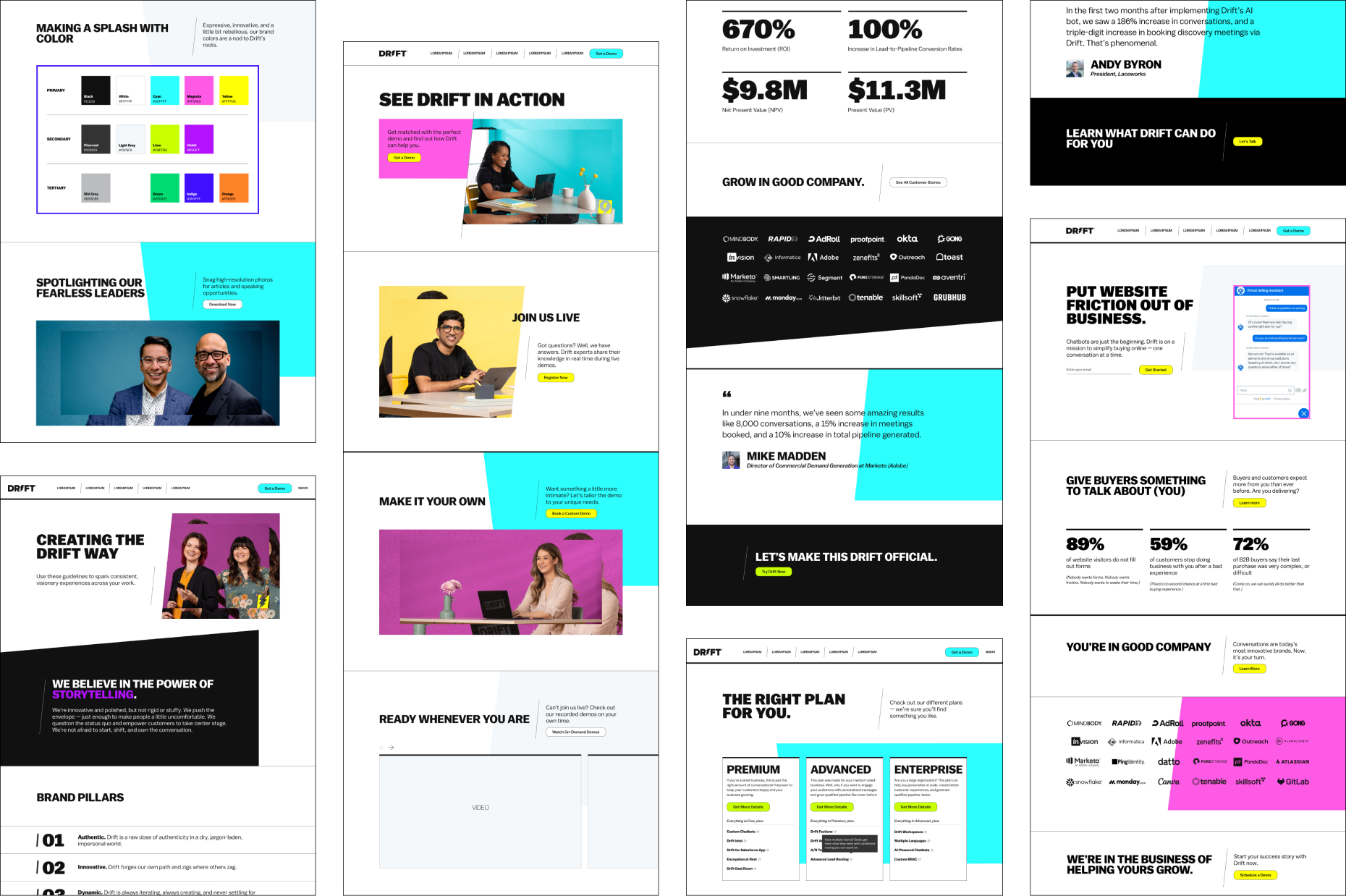
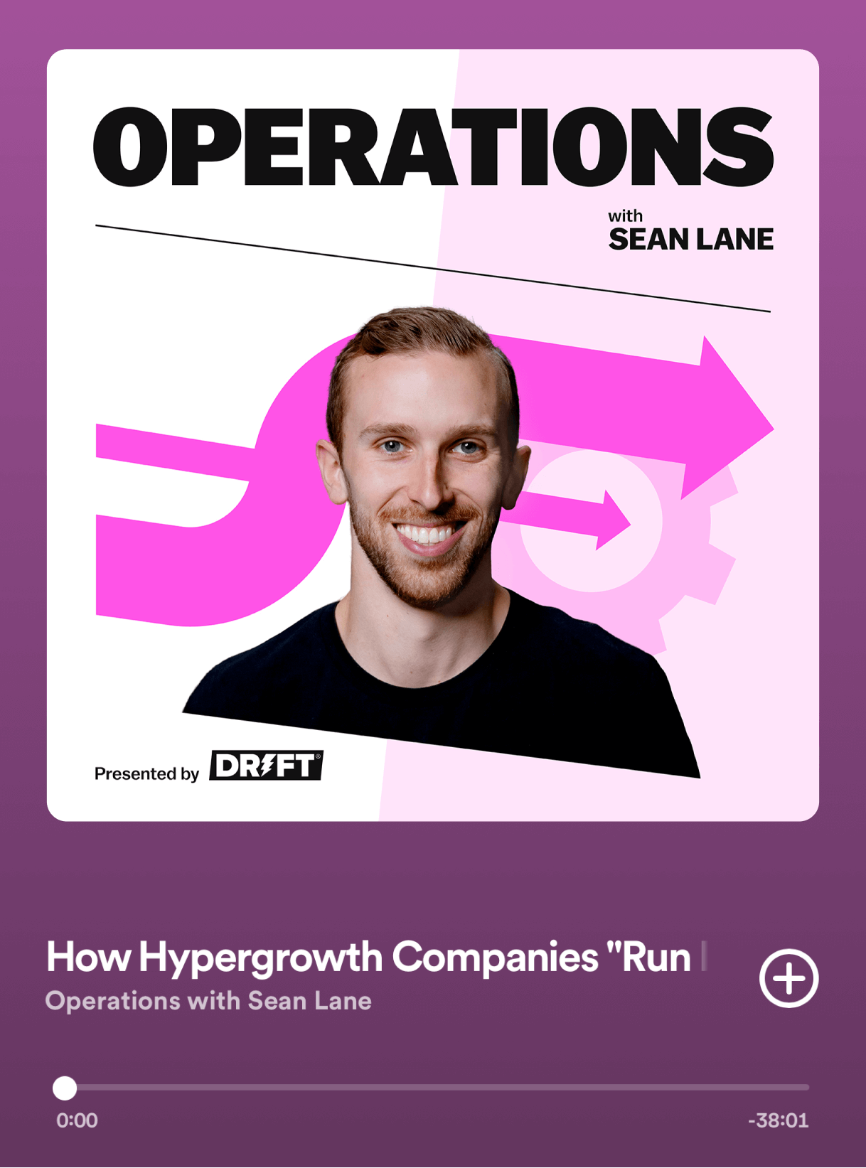
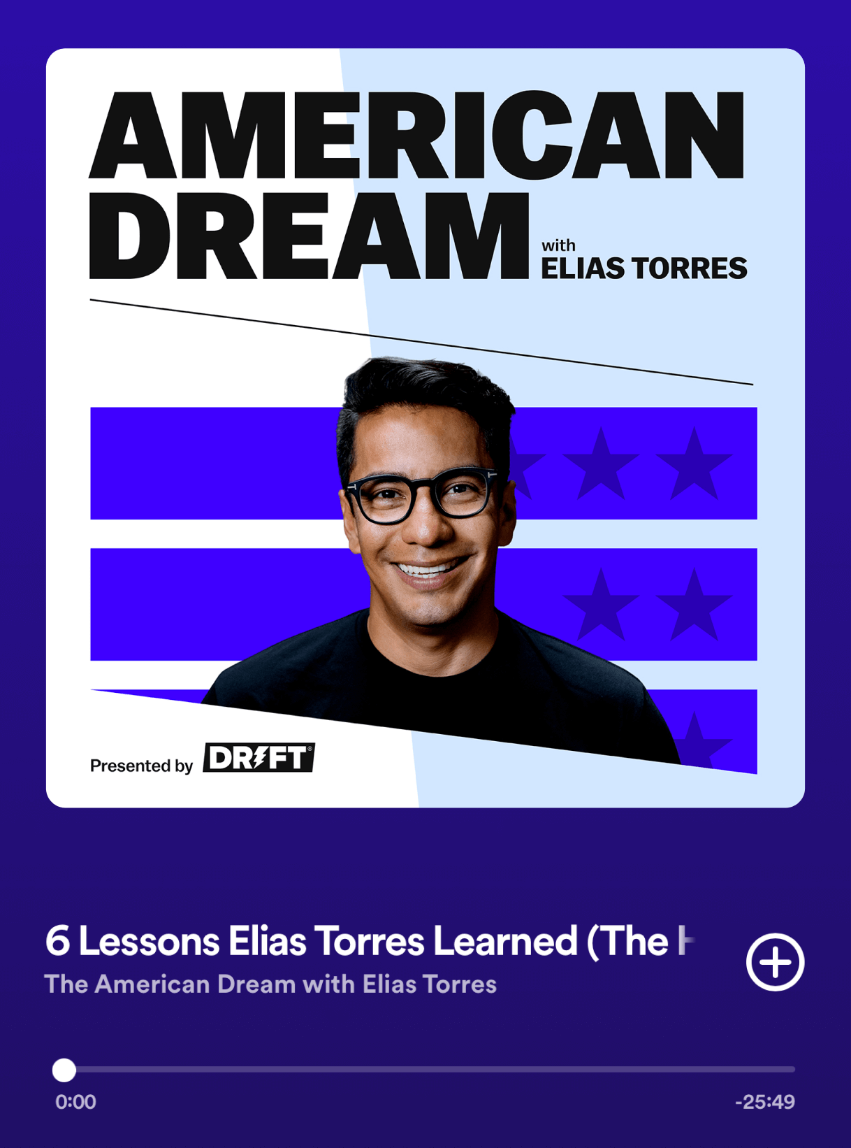
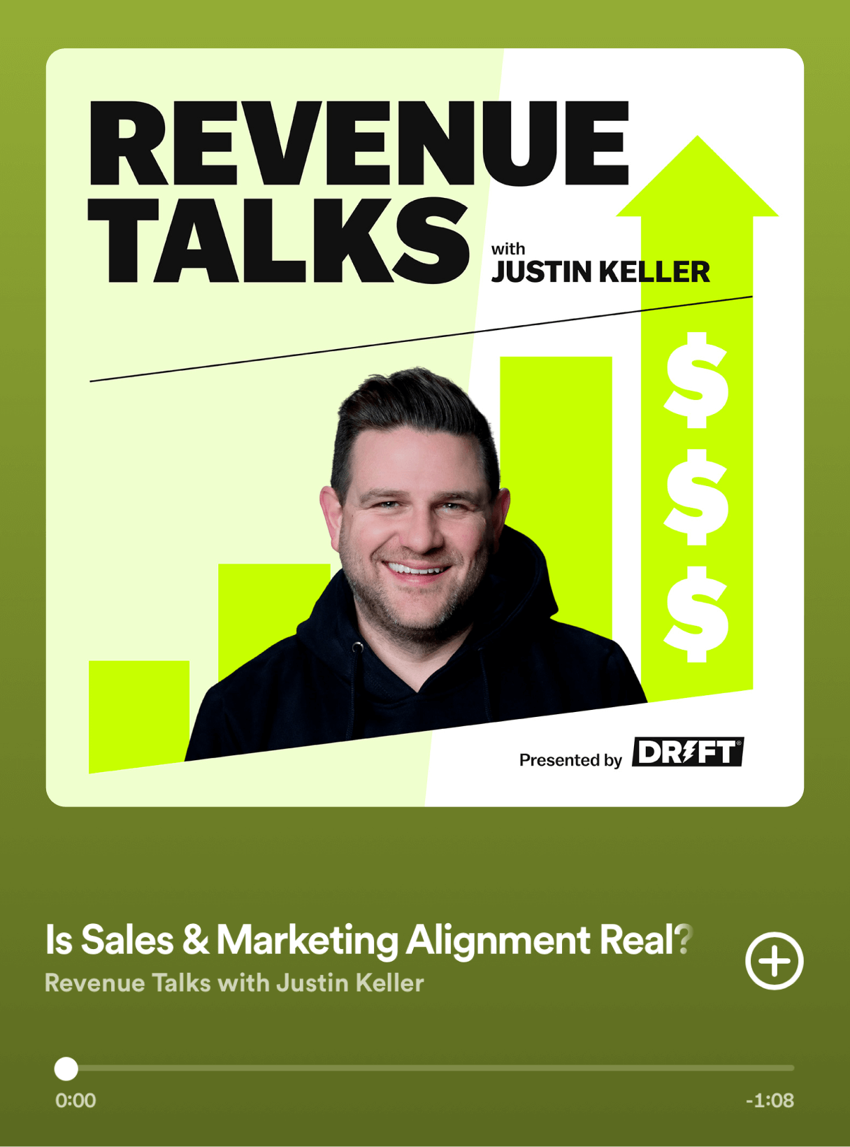
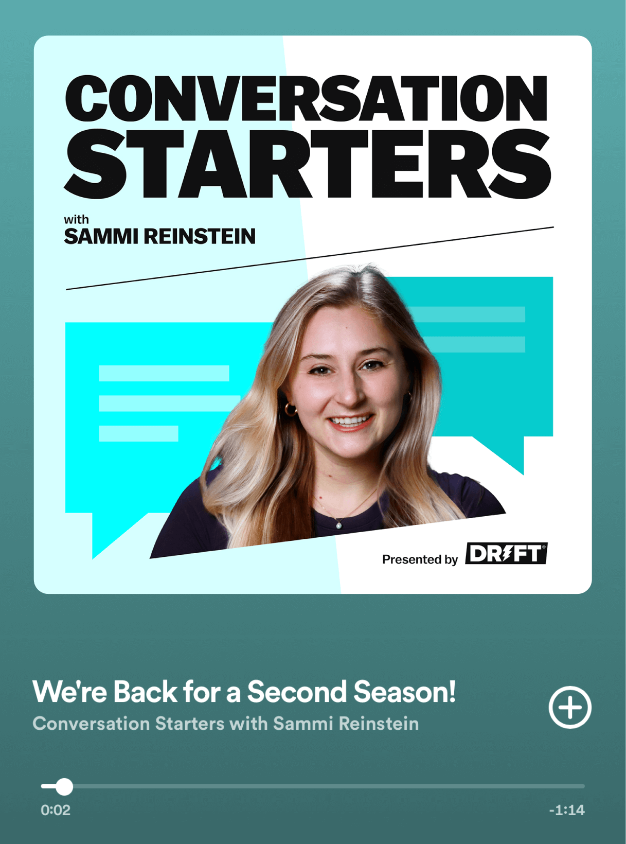
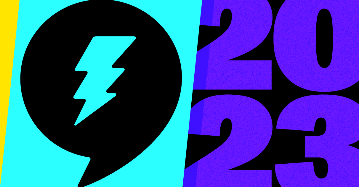
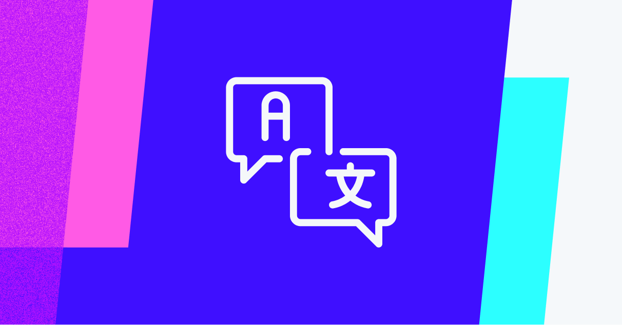
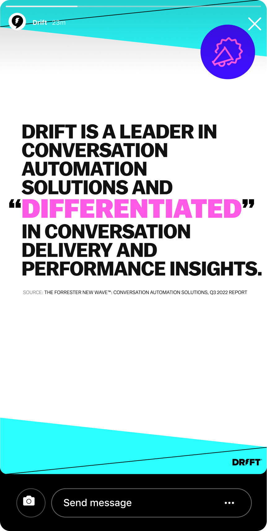
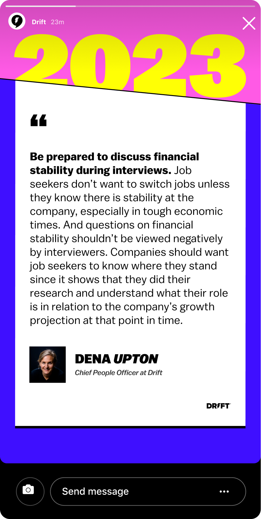
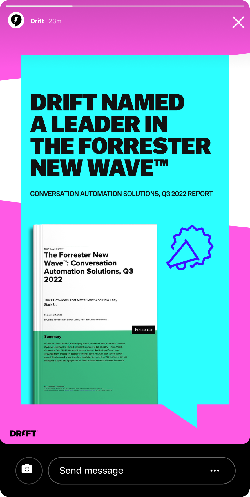
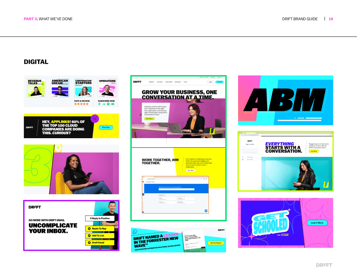
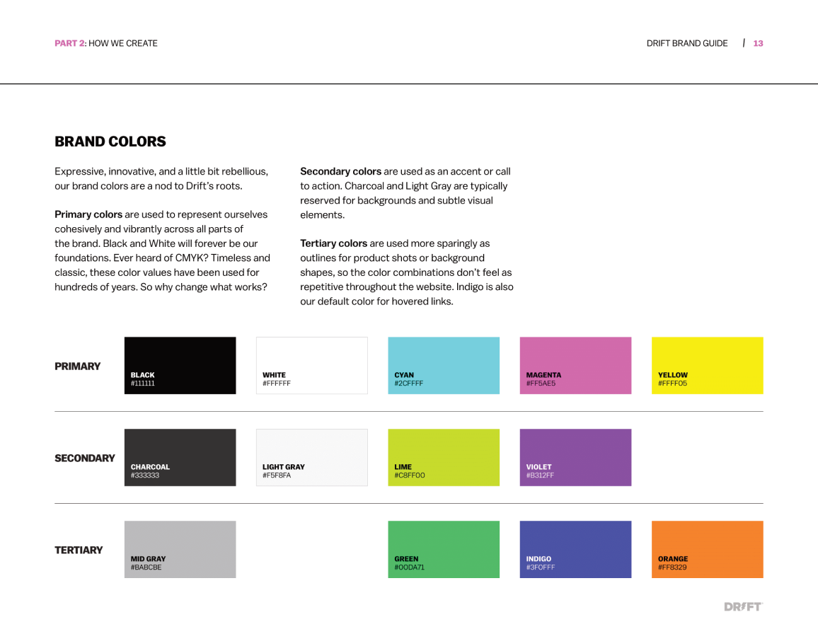
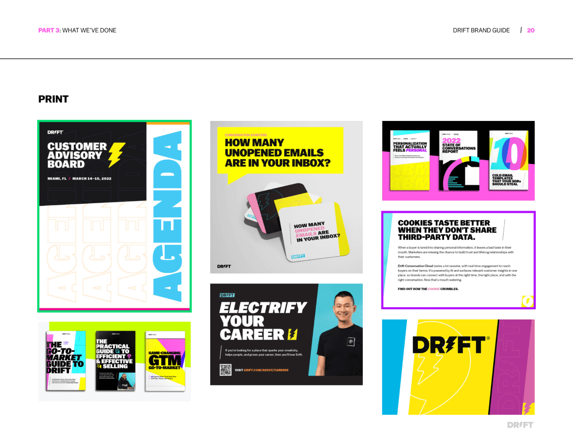
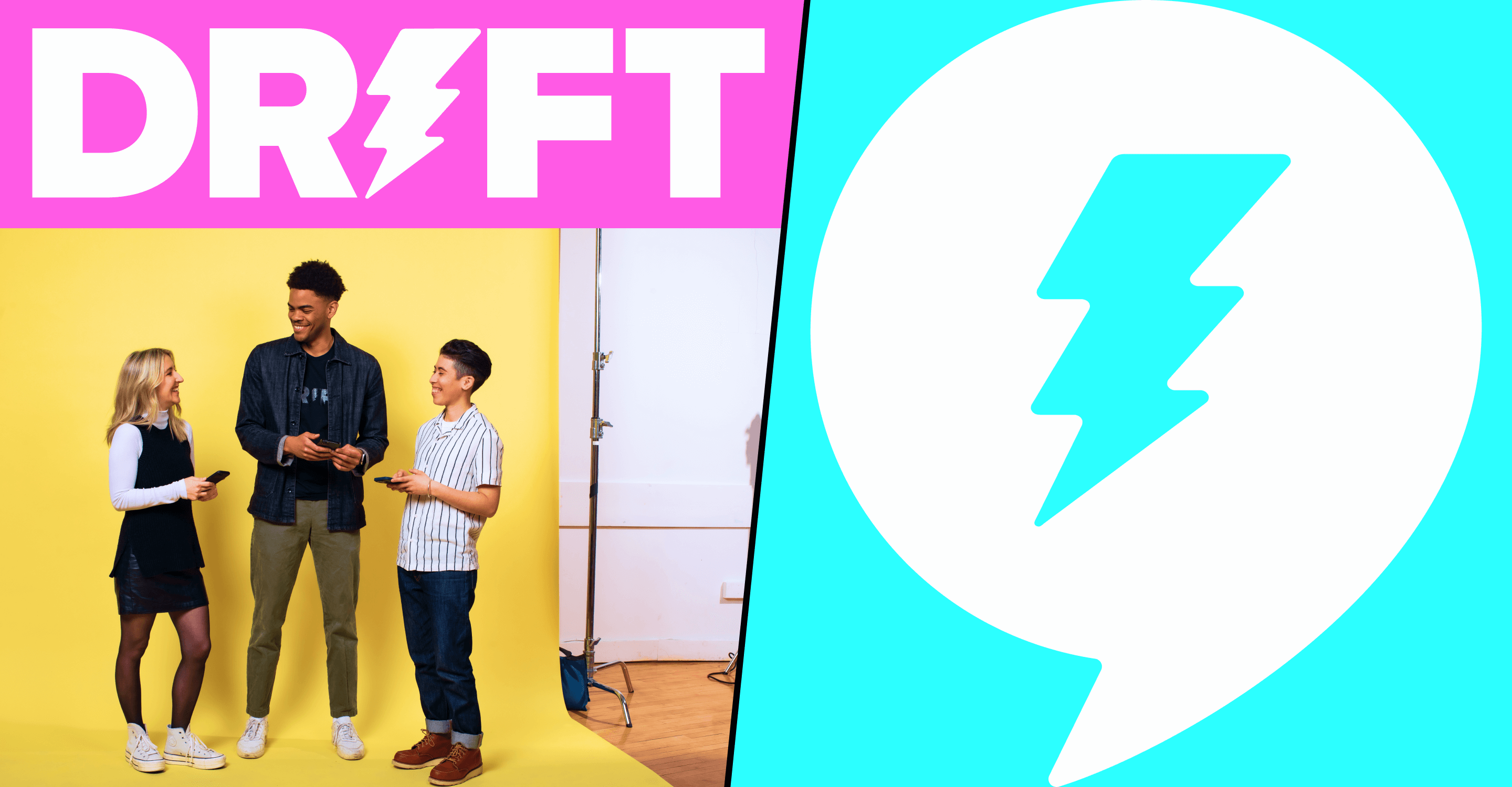
Drift 2.0 refuses to blend in with the sea of B2B SaaS blue hues. The evolution that we created is anchored in bright CMYK values, angles, movement, texture, and real human beings. It is bold, elevated, expressive, inviting — and most importantly, it honors the brand values and visual motifs that made Drift so unique when it first entered the market.
Drift 2.0 refuses to blend in with the sea of B2B SaaS blue hues. The evolution that we created is anchored in bright CMYK values, angles, movement, texture, and real human beings. It is bold, elevated, expressive, inviting — and most importantly, it honors the brand values and visual motifs that made Drift so unique when it first entered the market.
Drift 2.0 refuses to blend in with the sea of B2B SaaS blue hues. The evolution that we created is anchored in bright CMYK values, angles, movement, texture, and real human beings. It is bold, elevated, expressive, inviting — and most importantly, it honors the brand values and visual motifs that made Drift so unique when it first entered the market.
Drift 2.0 refuses to blend in with the sea of B2B SaaS blue hues. The evolution that we created is anchored in bright CMYK values, angles, movement, texture, and real human beings. It is bold, elevated, expressive, inviting — and most importantly, it honors the brand values and visual motifs that made Drift so unique when it first entered the market.